Zelis DLS
More consistently and reliably manage experiences through a unified Design Language System
Through acquisition, Sapphire had two products, SmartShopper and S365, each with its own design style and separate teams for design, product, and engineering. When SmartShopper's guidance features started to be added to S365's "find care" tool, the different designs and code didn’t work well together, causing extra work.
As both products were offered to the same clients, users found the different experiences confusing. Clients also wanted more control to make these products match their own brand and provide a consistent healthcare experience.
Moving from layouts to atoms
Rooted in atomic design theory, the designed system set out to provide the most flexibility while maintaining consistent patterns that increase user comprehension and trust. The atomic methodology is a hierarchical structure comprised of six elements that build on top of one another to enable efficient, high performing, and flexible component assemblies. They build as follows:
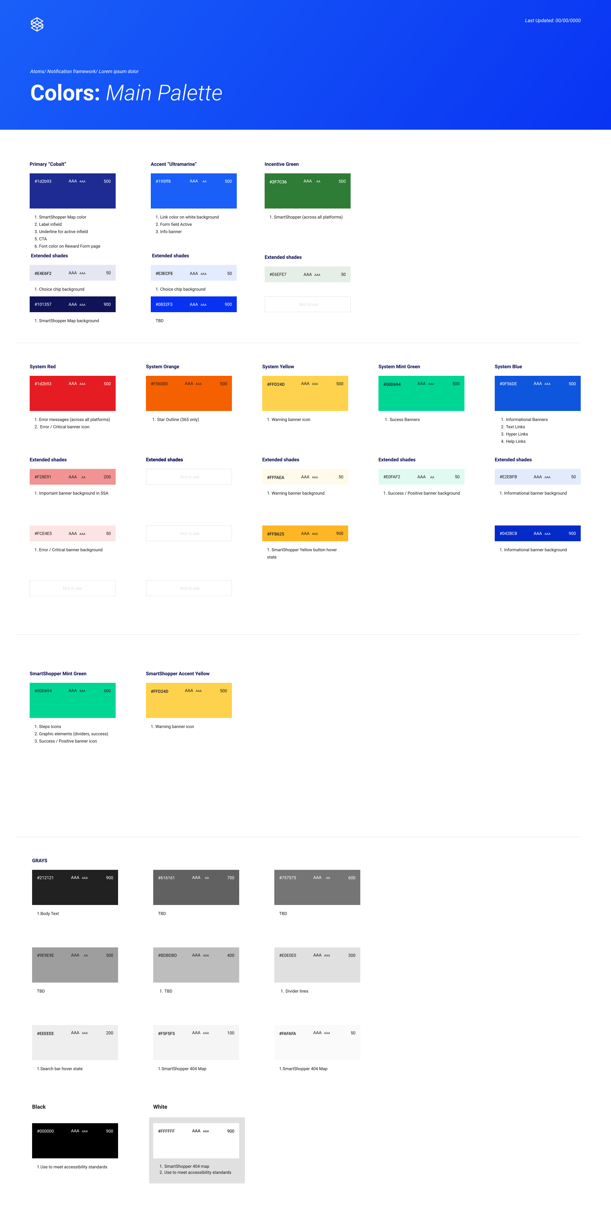
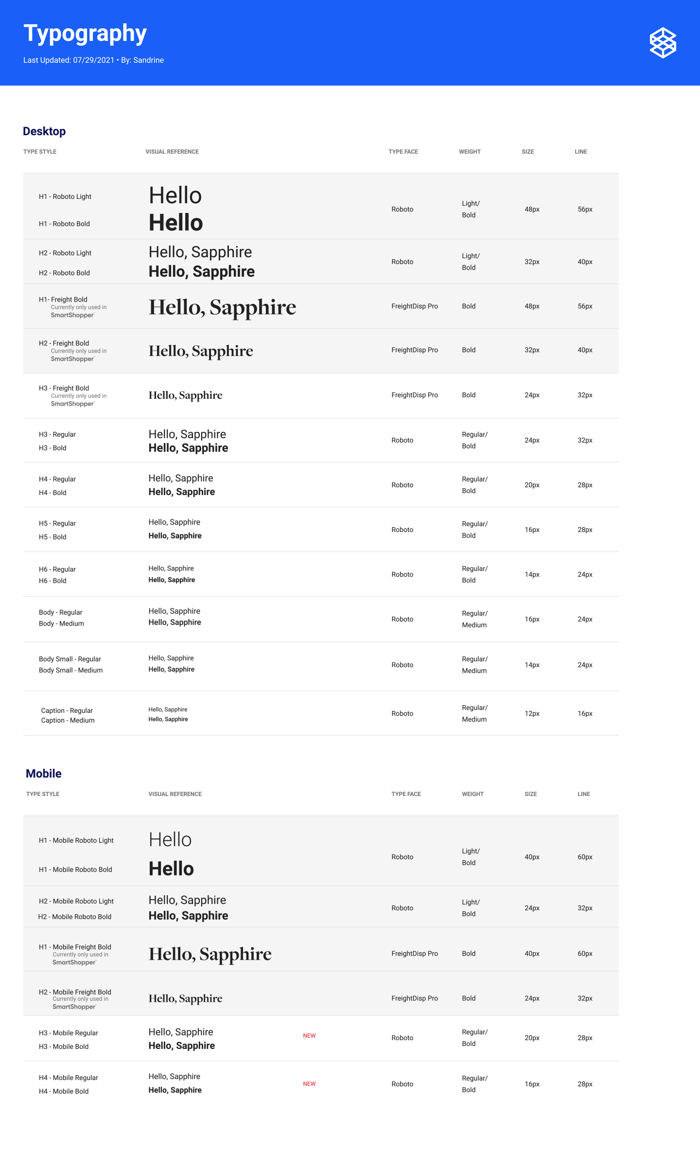
Styles: Properties that define the structure and appearance of components – typically what is thought of when you hear “style guide.” (ex. colors, typography, elevation, rounded corners)
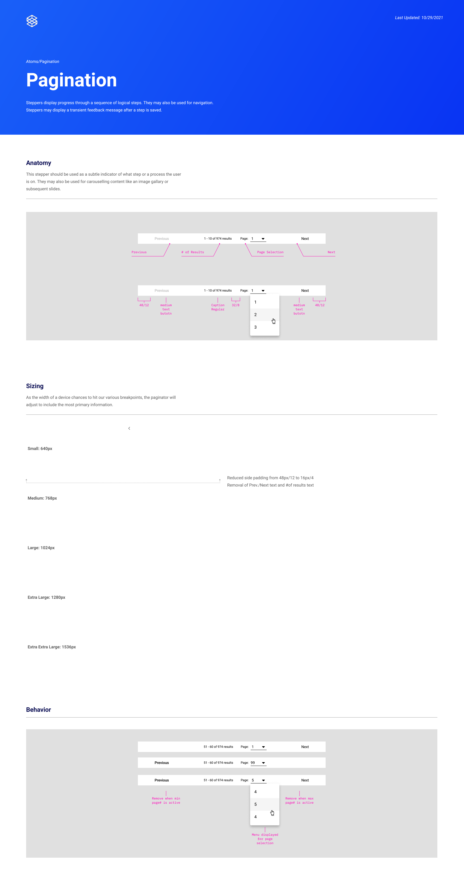
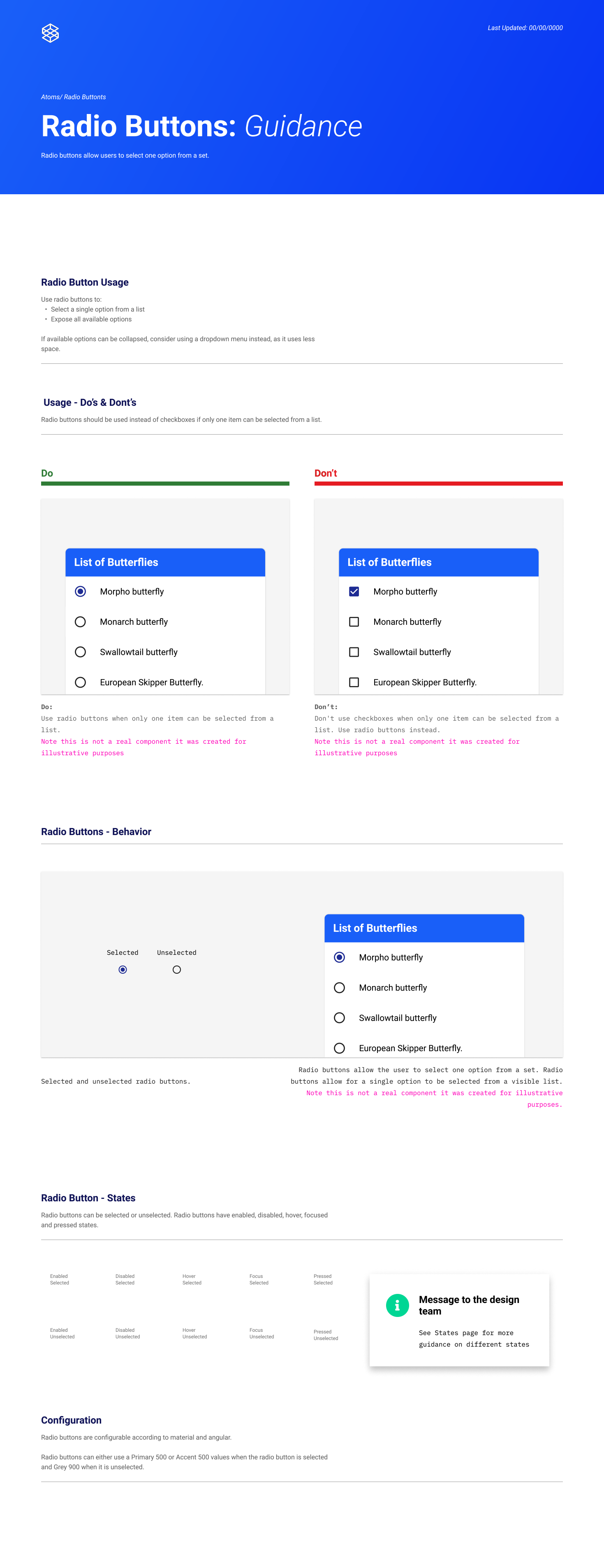
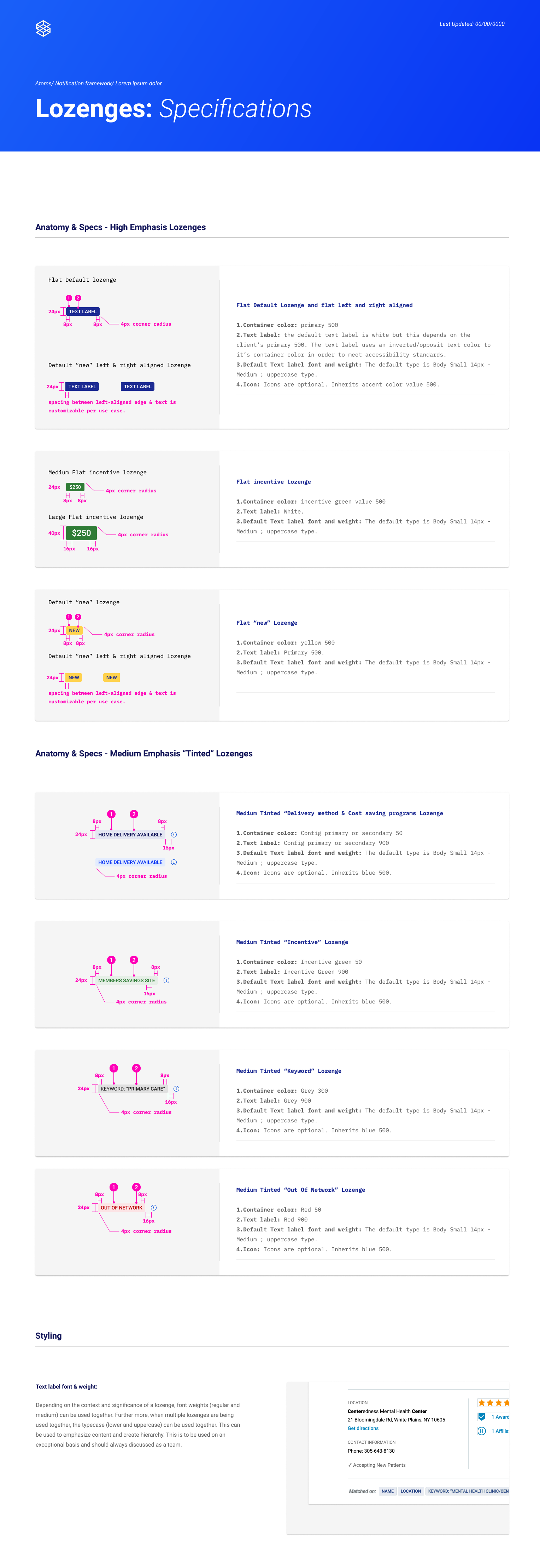
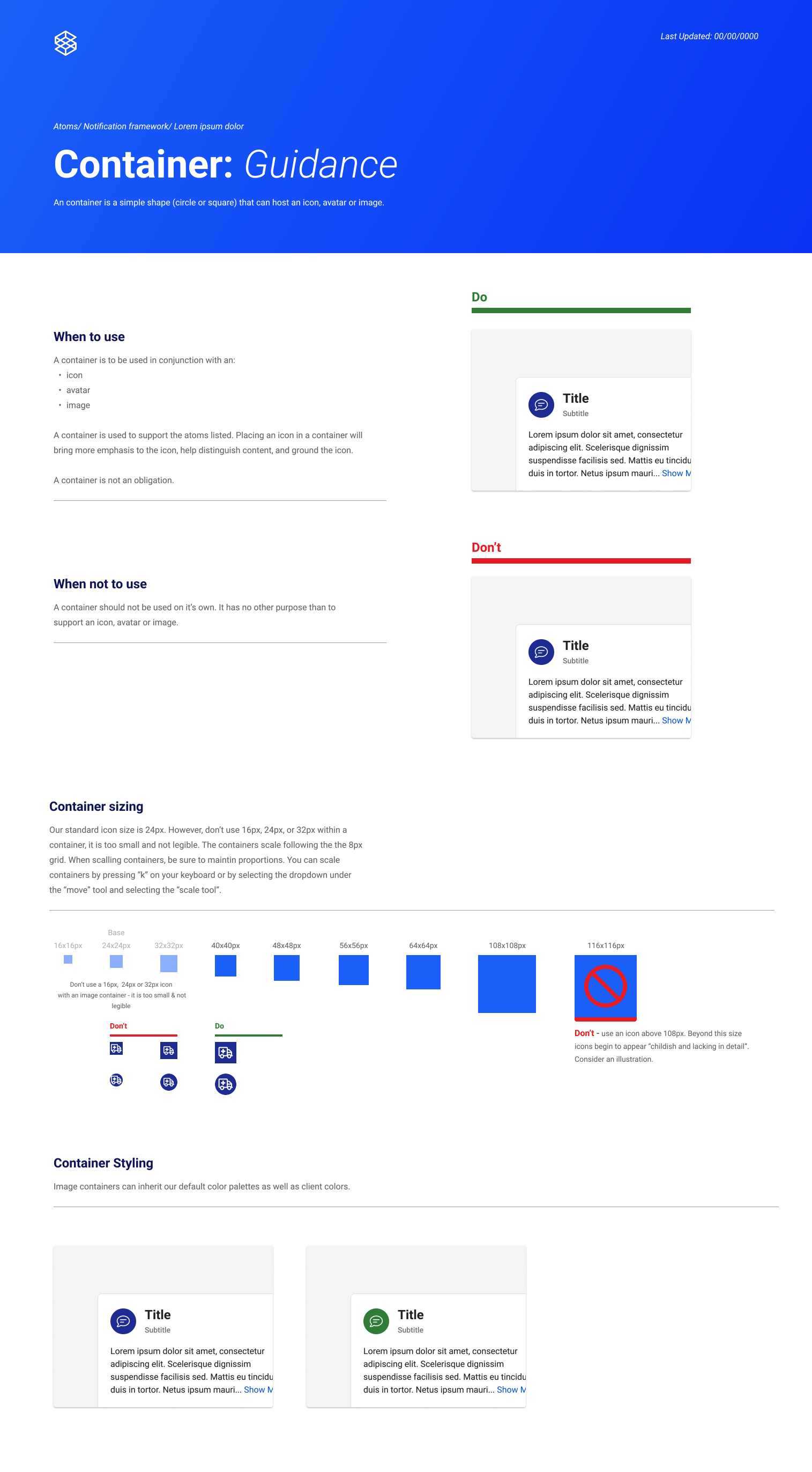
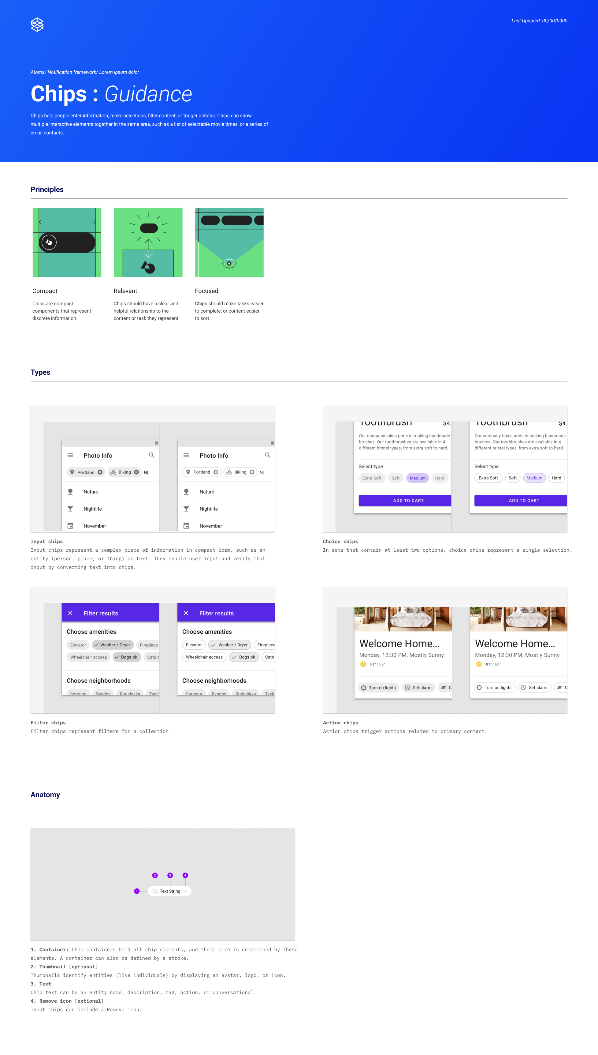
Atoms: The most granular components – can’t be broken down any further without losing functionality. (ex. buttons, form input, checkbox, badges)
Molecules: Relatively simple groups of UI atoms that function together as a unit. (eg. banners, search bar, expansion panels, dialogs)
Organisms: Properties that define the structure and appearance of components – typically what is thought of when you hear “style guide.” (ex. colors, typography, elevation, rounded corners)
Template: Reusable page layout that can support different component compositions. (eg. SERP page template [comprised of global nav, filter tray, result section, etc.]).
Page/Screen: The specific instance of a full page in the experience. (eg. authenticated homepage for a member with SmartShopper).

The adoption of the Design Language System led to significant efficiency gains for an organization including 34%+ faster workflows, 140% ROI across product and engineering, and minimal (10%) contributor bandwidth required.
Enabled Design and Engineering teams to complete work quickly and at scale: By leveraging premade components, designers put together mocks faster, PMs referenced standardized systems for their tickets, and engineers readily pulled from a shared, consistent repo.
Ensured consistency of UI across platforms, channels, and for individual contributors: Deploying the same components in different products ensures that the visual language and underlying UX remains consistent and compliant with accessibility requirements, which is important when developing an end-to-end omni-channel experience.
Eliminated knowledge silos: Extensive thought and reasoning for why components assemble certain ways and how they behave under given circumstances documented in Figma and Storybook reduced the clarification cycles between key stakeholders and delivery partners.
Enabled teams to make the decision to focus on more strategic, complex problems: Decreased the amount of time needed for general feature updates freeing up time for those teams to dedicate to upfront research, northstaring, and strategic initiatives.
Allowed for faster iteration of existing components.
Established the framework to enable customer requested CSS injection.
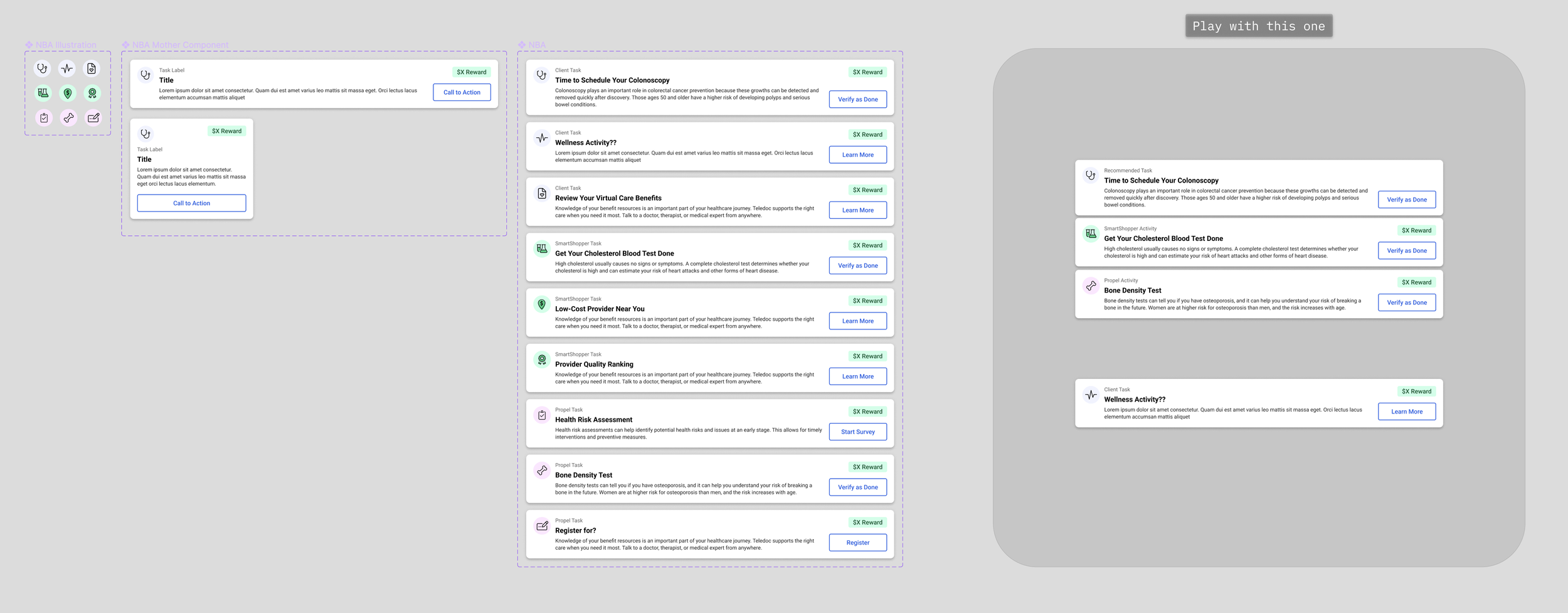
Example Figma Component Kit:
UI component kits managed in a master Figma file to allowed for faster design experimentation and validation through suer testing and rapid client feedback.
Efficiencies of the DLS Assembly Model
The DLS is a standardized collection of best practices, repeatable design components, procedures, usage rules, and experience patterns to allow for more efficient cycles from concept to code. Designed and managed in a master Figma file as part of the product design practice, the User Interface (UI) component library provided a reference for product and engineering teams to plan Angular projects.
Final and approved components from the master Figma library were built and managed in a Storybook code repository. This enabled engineers to easily pull components directly from the repository into a project without requiring any support from a designer. It also liberated the designers from low value design production tasks to higher value design activities including new solution design, continuous discovery, user testing, and journey measurement.
-

Stage 1: Layout, variations, and UX perspectives for components created
DESIGN
Our Design Language System begins with Designers developing the styles and UX perspective for a given component (done inside figma).
-

Stage 2: Components developed in a monorepo
ENGINEERING
Developers work with designers to translate the components into code, which live in our monorepo (we use Storybook to work in it).
-

Stage 3: Deployed to platform and channels
ENGINEERING
Developers pull components directly from the repo when starting new work calling for the use of specific atoms, molecules, organisms or pages.
